 EN
EN
Here is a conversation I have had more times than I can count. A brand owner comes to us with a Pantone number and says, "I want exactly this color." Then I ask them one question that changes everything: "Do you want this color on a clear bottle, an opaque bottle, or a colored bottle base?" The answer is almost always a blank. Because nobody told them that the same color behaves differently depending on what it is printed on, and that the printing method itself has hard limits on how many colors you can layer before the whole thing starts looking muddy.
Color is the first thing a customer sees. Before they read the ingredient list, before they smell the fragrance, before they feel the pump action—they see the bottle. And in a category as crowded as hair care packaging, which was valued at $6.84 billion in 2025 and is projected to reach $10.56 billion by 2034, that first impression is doing a lot of heavy lifting.
This guide is about the practical side of shampoo bottle color customization. Not mood boards. Not "brand personality" worksheets. The actual decisions you need to make, and the printing limitations you need to understand before you commit to a design.
The Strategic Role of Color in Shampoo Bottle Packaging
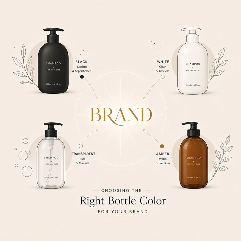
Let us start with why color matters beyond aesthetics. A shampoo bottle's color communicates positioning faster than any label copy can. A deep, matte black bottle signals premium salon quality. A soft, translucent amber bottle suggests natural, botanical ingredients. A clear bottle with a colored gel inside says "look at me—my product is the hero." A white bottle with minimal typography reads as clinical and dermatologist-approved.There are also various warm color cosmetics such as purple and pink colors, which look very suitable for the target user groups including girls and babies.
The 2026 color direction across beauty packaging reflects something brands should pay attention to: calm over spectacle. Pantone's Color of the Year for 2026 is Cloud Dancer, a soft warm white, while WGSN and Coloro have identified Transformative Teal as a key direction rooted in restoration and the intersection of nature and science. Earthy tones—sage green, amber brown, dusty blue, mocha—are showing up across premium hair care lines because they communicate authenticity and sustainability without saying a word.
But here is what separates a strategic color choice from a random one. When Dove redesigned its hair repair packaging in 2026, they shifted to a darker palette that included non-carbon black pigment, which improves recyclability by making the bottles more detectable in recycling systems. That is a color decision that serves two masters: shelf differentiation and environmental responsibility. If your brand is making sustainability claims, the color you choose has regulatory and practical implications beyond looking good.
Basic pop colors - never going out of style
Zhenghao factory has been engaged in the custom production of shampoo bottles for over 20 years. We can confidently say that when new brand owners choose a base color that matches their product concept, they will never be wrong! An emerging brand should take the first step without relying on extensive experience. In this market, having inventory is crucial. And these basic colors will never make your product outdated.
Black Shampoo Bottle vs. White Shampoo Bottle:
Black and white are the two most reliable colors in shampoo packaging, but they accomplish completely different things.
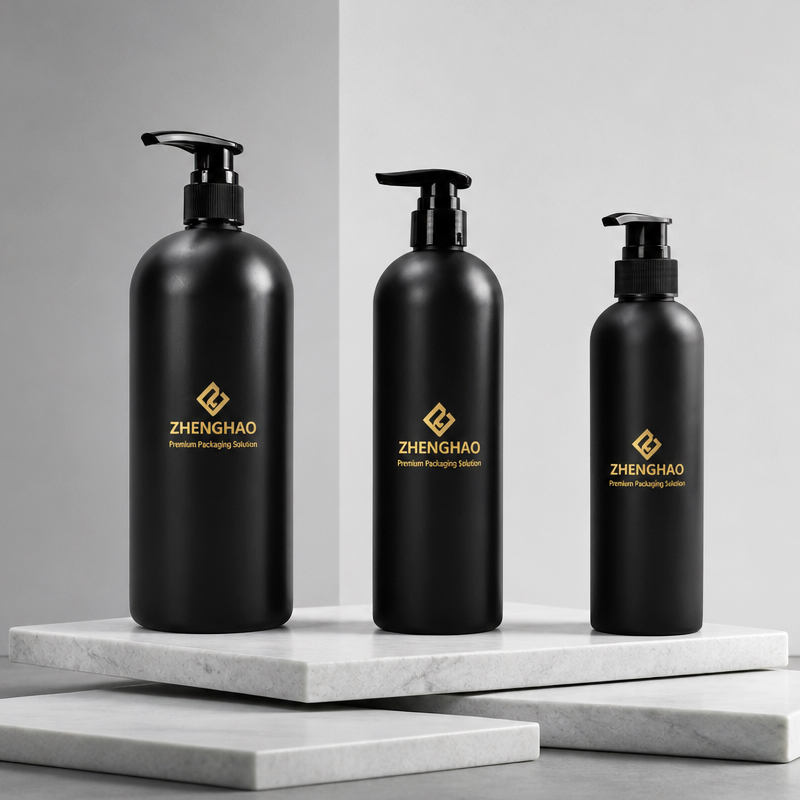
A black shampoo bottle creates instant gravity. It feels expensive. It feels serious. For men's grooming lines, salon-grade formulas, or anti-dandruff products that need to communicate efficacy, black is the default for a reason. But black is not a single color—it is a spectrum. Jet black, smoky black, matte black, and glossy black each carry different associations. One interesting design solution we have seen uses a lighter smoky black that lets the user see the remaining product volume through the bottle as it is used, solving the practical problem of opaque packaging while keeping the premium aesthetic. If you want a black bottle with color printing on top, the contrast works in your favor—bright graphics pop against dark backgrounds. But if you want a subtle, tonal design on black, you need to choose your ink carefully because dark-on-dark printing can disappear.
A white shampoo bottle is the opposite. It is clean, approachable, and versatile. White is the safest color for a new brand because it works across demographics and product categories. It photographs well, which matters enormously for e-commerce. And white bottle bases accept almost any ink color without the ink fighting the substrate. The trade-off is that white does not differentiate. If every competitor on the shelf is white, you need another element—shape, finish, label design—to stand out.
Clear Shampoo Bottle vs Amber Shampoo Bottle vs Blue Shampoo Bottle:
The clear shampoo bottle lets customers see the product, which can suit transparent gels, botanical formulas, and light fragrance concepts. It also makes fill level, air bubbles, sediment, label alignment, and formula variation easier to see.PET is commonly selected when a brand wants a clear, lightweight bottle. Yet transparency is not an automatic win. If a formula contains pearlescent additives, suspended particles, or a variable tint, review filled samples rather than approving an empty bottle only. Empty packaging is a poor actor; it rarely behaves like the finished product.If a formula is light-sensitive, a more protective bottle color, an opaque sleeve, or a larger printed area may be worth considering. The right answer depends on formula testing and product positioning. For a softer look, translucent resin, a tint, or frost can provide visibility without a fully colorless body.
The blue shampoo bottle occupies a specific space in consumer psychology: trust, hydration, freshness. Cool-toned blues communicate moisture and cleanliness, which is why they dominate the hydrating and volumizing segments. But blue is also one of the harder colors to print consistently. Pigment load affects how blue reads on different plastic substrates—a blue screen-printed on a white HDPE bottle looks different from the same blue on a clear PET bottle. If your brand guidelines specify an exact blue, you need to test the ink on the actual bottle material before production, not after.
The amber shampoo bottle is a functional choice as much as an aesthetic one. Amber plastic or glass blocks UV light, which protects light-sensitive ingredients like essential oils, botanical extracts, and certain actives from degradation. For natural and organic hair care brands, amber signals both the product philosophy and the protection promise. But amber bottles have a printing limitation that catches brands off guard: screen-printed colors on amber backgrounds tend to shift. A white ink on amber reads as cream, not white. A blue ink on amber reads as teal, not blue. The substrate color is always part of the final color, whether you plan for it or not.
Custom Shampoo Bottle Colors for Sustainable Brands
For the shampoo brands, black, white, amber, and clear remain reliable foundations because they are easy to position and adapt across a growing product range. More established brands, however, can use color as a strategic packaging tool rather than simple decoration. For sustainability-led lines, consider detectable non-carbon black, recycled-content-compatible color options, or enhance the decorative effect, such as through surface treatments like painting, sanding, matte finish, etc., while incorporating sustainable color concepts and eco-friendly materials.The goal is not to chase every trend, but to build a color system that helps customers recognize the range, supports recycling considerations, and still feels relevant when the next product variant arrives.
If your brand wants to differentiate on sustainability, there are three directions to approach color strategy. First, choose carbon-black-free dark pigments. There are already mature NIR-detectable black masterbatches on the market, such as Ampacet’s REC-NIR-BLACK series, or bio-based black pigments derived from lignin, which allow dark packaging to be identified and sorted at recycling facilities. Second, lean into the natural undertone of PCR material. PCR plastic often carries a slight gray or beige base tone—instead of fighting to cover it, treat it as part of the design language. Many sustainable brands actually use that “imperfection” to communicate authenticity. Third, replace color coverage with surface treatment. IZEL Beauty used both frosted and pearlescent finishes on a 35% PCR bottle, paired with screen printing and hot stamping, to achieve the premium feel expected in high-end hair care—without relying on extra plastic layers or non-recyclable pigments.
There are also printing choices that align with a sustainability direction. When screen printing uses UV-cured inks, a single pass can cover a large graphic area, reducing ink consumption and drying energy. Hot stamping with recyclable transfer foils does not compromise the bottle’s overall recyclability. Shrink sleeves deliver strong visual impact, but if the sleeve material and bottle material do not match, they can actually hinder recycling—in that case, heat transfer labels are the more practical choice. At the end of the day, a sustainable packaging color strategy is not about “designing less”—it is about “designing differently”: swapping carbon black for detectable alternatives, turning PCR’s base tone into part of your brand identity, and moving from multi-layer printing to single-pass application. These adjustments do not sacrifice shelf presence, but they give your bottle a second life in the recycling system instead of sending it to an incinerator.
Color Matching at the Resin Level: How Custom Colors Actually Get Made
There are two ways to get a colored shampoo bottle. You can print color onto a neutral bottle, or you can color the plastic itself. These are not interchangeable approaches, and the right choice depends on your design.
Color matching at the resin level means the pigment is mixed into the plastic before the bottle is molded. The result is a bottle that is the same color all the way through—no scratching reveals a white bottle underneath. No wearing at the edges. No inconsistency between the cap and the body. This is how you get a black shampoo bottle that stays black, a white shampoo bottle that stays white, or a custom blue that matches your brand guidelines across multiple production runs.
The practical advantage of resin-level coloring for brands is consistency. When you color at the resin level, you lock in a Pantone reference and every bottle in the batch matches. When you print color onto a neutral bottle, you are dependent on ink consistency, screen condition, and operator technique—all of which introduce variables.
The trade-off is flexibility. Resin-level color requires a minimum order quantity that makes sense for the molding setup. If you are producing 10,000 bottles in a single color, resin-level coloring is economical. If you are producing 5000 bottles in five different colors, printing is more practical.
For brands using PCR (post-consumer recycled) plastic, there is an additional consideration. PCR batches can vary slightly in base color, which affects how printed inks read on the surface. If you are committed to both sustainability and exact color matching, discuss consistency expectations with your supplier before you finalize your color strategy.
Silk Screen Printing on Shampoo Bottles: The Layering Limits Nobody Tells You About
Now we get to the part that separates a supplier who just takes orders from a supplier who actually knows how to execute a design.
Silk screen printing is the workhorse decoration method for custom shampoo bottle manufacturing. The process works by pushing ink through a fine mesh screen, one color at a time. For a multi-color design, you need multiple screens, and each color must be printed and allowed to dry before the next one goes on.a multi-color silk-screen design is produced by layering colors one pass at a time.
Here is the hard limit that comes up in almost every complex design project: six colors is the practical maximum for high-quality screen printing on plastic bottles. After six passes, the ink layers start to build up too thick, which affects adhesion, creates registration problems, and makes the print feel raised rather than integrated. Our own silk screen technicians have a saying about this: "Five colors is comfortable. Six colors is possible. Seven colors is a gamble." And gambling on a 10,000-piece production run is not a strategy.
Therefore, if you choose the cheaper screen printing method, the number of colors for the bottle body and logo printing should not exceed six. Otherwise, the actual printing effect will be greatly reduced due to the color overlay. We have encountered many customers who prefer customized colors for their shampoo bottles, thinking that the more colors there are, the more magnificent the bottle will be. However, this is not necessarily correct from a conceptual perspective, and it is also not a good choice from the perspective of screen printing technology. Of course, if the content to be printed or the logo indeed has many different colors, then choosing labels and UV printing would be a better option.
Working with The Shampoo Bottle Supplier: What to Ask About Color
When you are evaluating a shampoo bottle supplier, the color conversation should go beyond "Can you do this color?"
Ask about substrate testing. Your supplier should be able to print test samples on your actual bottle material before the production run. A blue that looks perfect on a digital proof can shift noticeably when printed on amber or colored plastic. Test samples are the only way to know.
Ask about color consistency across production runs. If you plan to reorder your bottles in six months, will the color match the first batch? Pantone references and resin-level color matching help, but you need a supplier who treats color consistency as a production standard, not a best effort.
And ask about MOQ at different customization levels. Standard stock colors typically have the lowest minimums. Custom resin colors require higher volumes. Fully custom designs with multi-color screen printing sit at the higher end of both cost and MOQ. Knowing these thresholds upfront prevents the awkward moment where you discover your dream bottle requires three times the budget you planned.
We previously encountered a customer who purchased a batch of shampoo bottles with a frosted surface from other factory. The logo was made using a gold stamping process. Initially, the bottles were fine when the bottles were received, the product was in perfect condition. However, after a long period of sea transportation and after three weeks, a large number of bottles showed varying degrees of color wear and fading on the logo. but upon our assessment, it was determined that the problem was caused by the gold stamping technique. Unfortunately, the bottles could no longer be returned for adjustment, so the customer had to abandon that batch of products and make new sample to be customized with us . Undoubtedly, this was a huge loss. Therefore, Zhenghao suggested leaving more time for testing and observation when customizing.
Final Thoughts
Color is not decoration. It is positioning, protection, and shelf strategy rolled into one decision. The right color for your shampoo bottle is the one that communicates your brand's promise, survives the printing process with its integrity intact, and can be reproduced consistently across every production run.
A coherent color system can build recognition across shampoo, conditioner, scalp care, travel sizes, and refill packs. Start with one hero color, then define how variants work beside it. The system should still make sense when products are wet, packed in a carton, or photographed for e-commerce.
At Zhenghao Packaging, we have been customizing shampoo bottles for brands for over two decades. We can handle the details so your color vision survives production intact. Our 20,000-square-meter factory and 8,600-square-meter dust-free workshop are equipped for orders of any size.
Ready to turn your color concept into a bottle that actually looks the way you imagined? Let us talk about your design, your material, and what it takes to print it right.
Table of Contents
- The Strategic Role of Color in Shampoo Bottle Packaging
- Basic pop colors - never going out of style
- Custom Shampoo Bottle Colors for Sustainable Brands
- Color Matching at the Resin Level: How Custom Colors Actually Get Made
- Silk Screen Printing on Shampoo Bottles: The Layering Limits Nobody Tells You About
- Working with The Shampoo Bottle Supplier: What to Ask About Color
- Final Thoughts