
 EN
EN
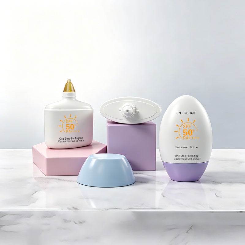
Walk down the sunscreen aisle of any drugstore or beauty shop, and you will notice something: white bottles are no longer the default. Today’s shelves are filled with bold cobalt blues, vibrant pinks, sunlit yellows, and warm oranges. Colors are doing more than just looking pretty—they are selling products, telling brand stories, and even protecting the formula inside.
For brands developing a new sun care line, choosing the right color for your packaging is one of the most consequential decisions you will make. According to McKinsey & Company, nearly 85% of consumers say color is the main reason they choose one product over another. That is not a small number. And when Mintel analyzed color-led packaging design across cosmetics, they found that it increased brand recall by over 38%. In a crowded market where dozens of sunscreens compete for attention, the right shade can be the difference between a product that flies off the shelf and one that gets overlooked.
This guide breaks down the colors that are shaping sunscreen packaging right now—why they work, what they communicate, and how to bring them to life through printing and customization. Whether you are launching a new brand or refreshing an existing line, understanding color trends will help you make packaging decisions that actually move product.
The Psychology Behind Sunscreen Bottle Colors: Why Color Matters?
Before we dive into specific shades, let us talk about why color matters at all. A sunscreen lotion bottle is often the first interaction a consumer has with your brand. They see the color before they read the label, before they pick it up, and certainly before they read the ingredients list. That first impression happens in milliseconds.
Different colors trigger different emotional responses. Blue conveys trust, reliability, and calm—qualities that align perfectly with the promise of sun protection. Orange and yellow evoke warmth, energy, and optimism—the feelings people want when they think about summer and sunshine. Pink feels playful, modern, and approachable, which is why it is increasingly showing up in sunscreens aimed at younger consumers. Brown and earth tones signal natural ingredients, sustainability, and a grounded, no-nonsense brand identity.
But color is not just about psychology. It is also about visibility. On a retail shelf packed with competing products, a distinctive color helps your sunscreen bottle stand out instantly. And in e-commerce, where thumbnails are tiny and scroll speed is fast, bold colors grab attention and communicate brand personality at a glance.
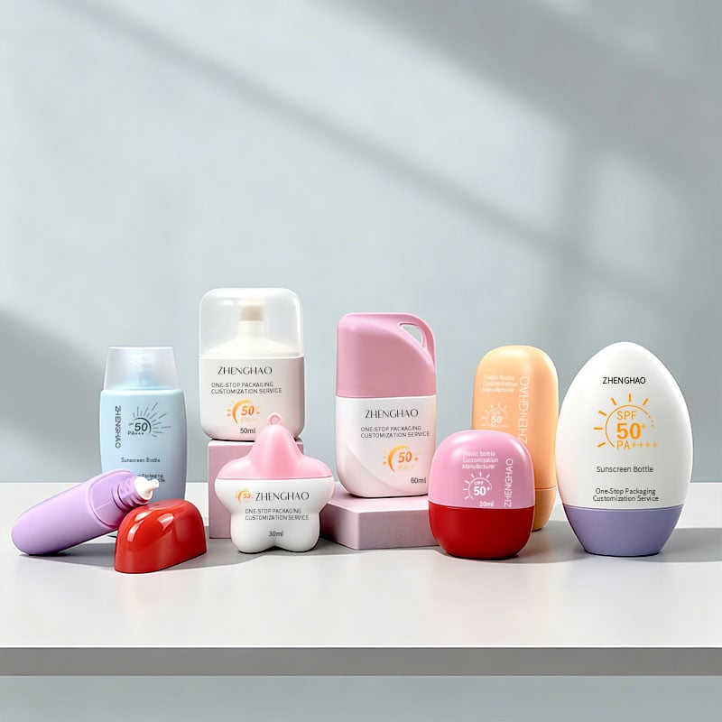
Sunscreen Blue Bottle: Trust, Protection, and Shelf Dominance.
Blue is arguably the most popular color in sunscreen packaging—and for good reason. Consumer research consistently shows that blue is one of the most preferred colors for packaging across categories. In the sunscreen space specifically, blue conveys a sense of calm and trust, symbolizing reliability in sun protection.
But there is also a functional reason blue works so well. Blue-tinted plastics offer superior light-blocking properties. Opaque blue bottles protect UV-sensitive sunscreen actives from degradation caused by light exposure. This means a sunscreen blue bottle is not just aesthetically pleasing—it is actively preserving the efficacy of the product inside.
Blue Lizard is perhaps the most famous example of blue done right in sunscreen packaging. The brand built its entire identity around a smart blue bottle with a photochromic cap that changes color when exposed to harmful UV rays. The blue packaging became so synonymous with the brand that consumers recognize it instantly. When Crown Laboratories rebranded the line, they kept the blue design because extensive consumer testing confirmed its superior shelf visibility and clarity in communicating product features.
For custom sunscreen bottle projects, blue offers tremendous flexibility. You can go with a deep navy for a premium, clinical feel, or a bright cobalt for a more energetic, modern vibe. Matte finishes on blue bottles add a tactile luxury that consumers notice, while glossy finishes enhance color vibrancy.
Pink Sunscreen Bottle: Playful, Modern, and Consumer-Forward
Pink is having a moment in sun care. Once considered too "girly" or niche for serious sun protection, pink has emerged as a powerful color for brands targeting younger demographics and consumers who want sunscreen that feels more like a lifestyle product than a medicine.
Late July, a brand that reimagined sunscreen as a summer accessory rather than a clinical necessity, uses vibrant pink alongside cobalt blue and sunlit yellow to create immediate shelf impact. The packaging was designed to feel collectible rather than disposable, and the bold pink hue reinforces the warmth and optimism of the season. The pink cartoon sunscreen bottle is very popular among young women consumers. By incorporating customized cartoon artistic designs patterns, it makes sunscreen care more fun rather than being serious and rigid.
A pink sunscreen bottle signals approachability and modernity. It appeals to consumers who want their sun protection to feel like a treat, not a chore. For brands targeting Gen Z or millennials, pink is a color that resonates. It photographs well for social media, stands out against the sea of white and blue on retail shelves, and communicates that your brand understands what today's consumers actually want.
From a customization standpoint, pink works beautifully with both matte and glossy finishes. Soft, muted pinks convey clean beauty and subtlety, while bright, hot pinks make a bold statement that demands attention.
Sunscreen Orange Bottle: Energy, Warmth, and Sun-Kissed Appeal
Orange is the color of sunshine, warmth, and energy. It is no surprise, then, that orange has become a go-to color for sunscreen brands that want to evoke the feeling of a perfect summer day.
A sunscreen orange bottle communicates vitality and resilience. In one sunscreen packaging design project, a vibrant orange palette was used to "evoke energy and resilience," while complementary hues captured warmth and introspection. Orange is also highly visible—it pops against almost any background, making it an excellent choice for products that need to stand out on crowded shelves.
Functionally, orange-tinted plastics offer similar light-blocking benefits to blue. The pigment helps filter out harmful UV rays that can degrade sunscreen formulations, extending shelf life and preserving efficacy. For high-SPF products positioned for intense sun exposure, orange is a natural fit—it visually reinforces the "strong protection" message.
Le Rub, a suncare brand, built its entire visual identity around a signature orange color that had to match perfectly across their entire product range. The result was a cohesive, instantly recognizable brand presence. For custom sunscreen bottle manufacturers, orange offers a wide spectrum—from soft, peachy tones that feel natural and soothing, to bright, almost neon oranges that scream energy and excitement.
Brown Sunscreen Bottle: Natural, Earthy, and Premium
Brown might not be the first color you think of for sunscreen, but it is gaining traction—particularly among clean beauty and natural skincare brands.
A brown sunscreen bottle signals earthiness, sustainability, and a commitment to natural ingredients. It feels grounded and premium, appealing to consumers who are skeptical of overly bright, synthetic-looking packaging. Brown is also excellent for light protection. Brown-tinted HDPE bottles offer enhanced light shielding for high-concentration sun care formulas, making them a practical choice for products with sensitive active ingredients.
For brands positioning themselves as eco-conscious or minimalist, brown is a natural fit. It pairs well with matte finishes and simple, uncluttered label designs. And because brown is less common in sunscreen packaging, it offers an opportunity for differentiation—your product won't look like everything else on the shelf.
Custom Color Matching: Getting the Exact Shade You Want
One of the most common questions we hear from brand clients is: "Can you match this exact color?" The answer is yes—but it requires careful planning.
Custom color matching starts with Pantone references. By providing a specific Pantone number, you give your sunscreen bottle manufacturer a precise target to hit. The color is then mixed at the resin level before molding, ensuring consistent color throughout the entire production run. This approach is more efficient than post-production tinting and results in faster fulfillment and lower costs.
However, there are important considerations. Custom-colored plastics must do more than look good—they need to enhance UV protection for the formulas inside. The pigment load and type can affect the material's performance, so working with an experienced custom sunscreen bottle supplier who understands these trade-offs is essential.
Also, keep in mind that color can vary slightly between batches of PCR (post-consumer recycled) material. If sustainability is a priority and you are using recycled content, discuss color consistency expectations with your manufacturer upfront.
Matching Printing Crafts to Colored Sunscreen Bottle Surfaces
Once you finalize your bottle base color, selecting compatible decoration techniques determines how crisp and long-lasting your brand graphics appear on retail shelves. Different tinted plastic surfaces react uniquely to silk screen, hot stamping and UV spray finishing, and misaligned printing choices lead to washed-out logos or easily scratched branding that weakens brand recognition over time. As a full-service sunscreen bottle manufacturer, we test all print processes on your selected bottle color before mass sampling to avoid costly post-production adjustments.
Silk screen printing works flawlessly on saturated colored vessels like sunscreen orange bottle and deep blue containers, delivering opaque, vivid Pantone ink that contrasts sharply against dark plastic backgrounds. This method is ideal for large brand logos, ingredient text lines and product feature callouts on sunscreen lotion bottle formats, with scratch-resistant cured ink that survives repeated consumer handling. Pastel pink sunscreen bottle and pale yellow styles pair beautifully with delicate gold or silver hot stamping; metallic foil creates subtle luxury detailing without overwhelming the soft base tone, a popular combo for premium facial SPF sold in department stores.
UV matte topcoats act as a universal upgrade for all colored plastic styles, sealing both the bottle tint and printed layers against sunlight fading and transport scuffs. Brands using earth-toned brown sunscreen bottle often add frosted UV finishing to tone down the raw plastic shine, building a natural, organic visual language that resonates with clean beauty consumers. We frequently combine multiple crafts for differentiated limited runs: silk screen brand names paired with partial hot stamp accents on mini colored travel bottles, creating eye-catching packaging that stands out amid generic white containers on retail racks.
Final Thoughts
The days of sunscreen looking like medicine are over. Today's consumers want sun protection that feels good, looks good, and fits their lifestyle. Color is one of the most powerful tools you have to communicate your brand's personality, differentiate from competitors, and drive purchase decisions.According to McKinsey, nearly 85% of consumers say color is the main reason they choose one product over another. And color-led packaging design can increase brand recall by over 38%. These numbers are too big to ignore.
Whether you choose a sunscreen blue bottle for trust and protection, a pink sunscreen bottle for playfulness and modernity, a sunscreen orange bottle for energy and warmth, a yellow sunscreen bottle for optimism and visibility, or a brown sunscreen bottle for natural earthiness—the key is to be intentional. Your color choice should reflect your brand, appeal to your target consumer, and work seamlessly with your printing and customization strategy.
At Zhenghao Packaging, we have been helping brands bring their color visions to life for over two decades. From custom color matching at the resin level to screen printing, hot stamping, and labeling, we handle the entire process so you can focus on what matters most: building a brand that consumers love.
Table of Contents
- The Psychology Behind Sunscreen Bottle Colors: Why Color Matters?
- Sunscreen Blue Bottle: Trust, Protection, and Shelf Dominance.
- Pink Sunscreen Bottle: Playful, Modern, and Consumer-Forward
- Sunscreen Orange Bottle: Energy, Warmth, and Sun-Kissed Appeal
- Brown Sunscreen Bottle: Natural, Earthy, and Premium
- Custom Color Matching: Getting the Exact Shade You Want
- Matching Printing Crafts to Colored Sunscreen Bottle Surfaces
- Final Thoughts